Thursday, 19 December 2013

The Matrix in relation to my visual project

1999 blockbuster hit ‘The Matrix’, directed by Lana and Andy Wachowski is of personal and significant artistic relevance to me. The clever usage of cinematic techniques still impress me to this day while its philosophical undertones spark an even deeper level of awe in my brain.

In relation to what I could take from this film to use for my visual project, I would like to incorporate the films handling of colour. To further explain, the matrix is set in a dystopian future where machines have taken over and enslaved mankind. Mankind is now being harvested by these machines and their brains remain active with the help of The Matrix. A digital version of earth, pre machine take over.

The matrix and the real world are always very easy to distinguish to the viewer without need for the directors to spoon feed the audience. This was made possible by the use of colour.

The Real World


The Matrix


From the very start of the film, before the concept of the matrix is even introduced to us, every shot is covered in a green tint. Suddenly, once Neo ventures out of the matrix for the first time, the green tint is gone and we can see the real world for the first time, just as Neo has. From then on, the audience can  clearly distinguish the two worlds from another by just a change in colour.

This specific use of colour is something I would like to include in my visual project in some way. A colour scheme that instantly tells the viewer something key about the piece without the use words or any other visualizations. The notion that colour is not just something that is there to give pure aesthetic value, it is a plot device that speaks to the viewer and gives them information on the media they are viewing. This is something I’d like to take from this film and possibly translate into a 2D media.

With the idea that my visual project will be either some for of animation or graphic design work I am thinking of incorporating these colour themes in a form of visual duality. The colour difference will distinguish possibly between two contrasting themes in my piece, in a similar way to how The Matrix distinguishes between its two separate worlds.

In summary, the main thing I want to take from my research into this film is the concept that colour is used as more than a aesthetic tool but rather a plot device.


Reference: Imdb-2013-Imdb.com[http://www.imdb.com/title/tt0133093/][Last accessed on 18/12/2013]

Monday, 16 December 2013

Art Nouveau in relation to my visual project

In the design world, Art Nouveau played very important role with just how wide spread it was. It wasn't just restricted to poster design or paintings; it was in architecture, furniture, sculpture, as well as many other aspects of day to day life. Art Nouveau is characterised by its close harmony with natural forms and nature and its handling of line. For my visual project, the main characteristic I want to borrow from this style is the way it handled line.

This poster by Alphones Mucha illustrates my inspiration perfectly. The handling of line in this style was done in a very graceful way. The lines are curved and flowing. With specific reference to the lines created in the hair of the figure we can see that the line plays a very important role in this piece. The lady’s hair seems to have been given a life of its own as it dances around her figure.   

For my visual project, I’d like to incorporate this harmonious use of line that is very evident in Art Nouveau. The curvilinear nature of the line also relates to my chosen theme of movement. With the poster by Mucha as a point of reference, we can see that the flowing curves in the image give us an impression that movement has been caught in the scene. While the movement implied in not harsh or dramatic movement, the movement implied is serene yet still present and this is something I’d wish to recapture in my visual project, subtle yet serene movement that entrances the viewer.  

While my chosen media for this visual project is uncertain, I am leaning towards graphic design or animation, both incorporating the curvilinear nature that is present in Art Nouveau. I feel that if I was to choose animation as my media, it would be interesting to give actual motion to the implied motion in the forms created by Mucha.
Reference:
  •          Image [http://en.wikipedia.org/wiki/File:Alphonse_Mucha_-_Job_Cigarettes_1.jpg]
  •          Wikipedia-2013-wikipedia.org[http://en.wikipedia.org/wiki/Art_Nouveau][Last accessed on 16/12/2013]

Futurism in relation to my visual project


The Futuristic movement in art was all about capturing movement and visualising it in the media popular at the time (Paintings, etc.). Birthed by the futurist manifesto written by Filippo Tommaso Marinetti, the futurist movement was striving to embrace the new while letting go of the past. Artists of the time were living in a world of rapid technological advancement, the roars of industry could be heard across Europe and their art reflected that.

Something that always intrigued me about the futurist movement is how movement is captured in a still image. This example by Giacomo Balla shows a dog and its owner that appears to be made up of several instances of the same scene layered onto one another. This use of repetition implies the subject has been caught in motion. For my visual project, I wanted to capture motion is a similar way that the futurists did. While not entirely sure of its practicality at this point, I wanted to recreate the futurist theme of movement in the form of animation, because what is the futuristic movement if not a predecessor of a moving image.

In the process of animation, the animator works in a similar way to how the futurist painters worked. An animator places image after image in a progressive manner to make the scene come to life when viewed in quick succession while the futurists did a similar thing but placed all the images onto one frame, letting us view the range of movement all at one time.  This depiction of a range of movement is what inspired me to use animation as a possible media for my visual project.

In the event that animation is not a possibility due to either time restraints or otherwise, I feel like it is also possible to translate the futurist style in a more direct way via graphic design. Showing a range of movement in something like a poster could give the design a very dynamic feel to it, in the same way that the futurist painting had.

The main thing that I want to take from the futurist movement is their treatment of movement. How image is layered over image to show a range of movements. Whether my chosen media will in fact be animation or something else, my main goal is to portray the theme of movement in the way the futurists did, through repetition.

Reference:
·         Image:[ http://bittleston.com/artists/giacomo_balla/]

·         Wikipedia-2013-wikipedia.org[http://en.wikipedia.org/wiki/Futurism][Last accessed on 16/12/2013]

Monday, 28 October 2013

Cell block tango (Chicago 2002)


Directed by Rob Marshall, Chicago is a film musical that follows the characters Roxy Heart and Velma Kelly as they try to escape the judicial system. In particular, I want to focus on the scene given the name of the ‘cell block tango’. This is a montage of varies inmates’ alibis spliced together with their musical renditions of such.

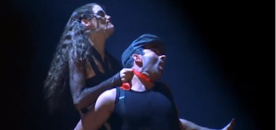
Starting the scene with a close up of Roxy Heart in her prison cell, we begin to hear a rhythmic increase in noises like water dripping and figure nails tapping. While this rhythmic buildup in sounds helps set the music in place for the song, I feel it is also relevant to our theme of movement. Movement through sound is something we do not think of very often and I feel like this is a good example of such. The increasing level of sound seems to drag us into the musical number by curiosity. It moves us through the song in the same way a camera would a scene.


In the same way that the music builds up, the action happening on screen does too. Each alibi is started off with calm music and an almost lighthearted setting.


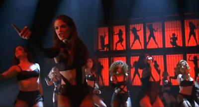
The scene then explodes with murderous intent, and the music and lighting reflect this. The movement present here is one from calm to dangerous. This dramatic buildup of tension is apparent in many aspects of this scene and I feel that movement plays a major role in this.


While the camera placement and scene changes move us through the story of this number, I feel that the choreography and music play a very vital role in the visual representation of this scene. In terms of choreography, there the same form of buildup present. After each alibi, a new dancing couple is added to the chorus. Starting with just one and ending with a climax of all the inmates in their final chorus. This buildup of dancers, like with the music and the effects in the scene, moves us through the climactic buildup that is this number.


As a last thing of note, I feel obliged to mention the sheer use of line in the imagery of this scene. Every position of the choreography has these dancers in a strong and dynamic pose. These strong, often diagonal lines imply harsh movement, making it apparent that these women are ready and willing to put up a fight if need be.


Reference: Imdb-2014-Imdb.com[http://www.imdb.com/title/tt0299658/][Last accessed on 20/01/2014]

Jules Breton ‘End of the working day’ (1886)

The Realist movement was a response to the Romantic movement in many ways. The Realists, namely the French Realists were creating their art in the times of a revolution. Ideas were changing in many aspects of society and are was no different. Realists wanted to capture the essence of they saw around them, the real  unadulterated look at what it was to be person living in that time. Hence, many of the Realists works were focused on they common man, rather than the nobility. 

When looking at this work by Jules Breton, the first feeling I get is one of calm serenity. While this picture depicting workers in a field can be discussed in possibly all our given themes for our assignment, I choose to discuss movement over the others.
The first aspect of movement I noted when looking at this piece is the movement created through the use of perspective. The converging lines that the crops create let your eye travel across the piece. This depth this work by Jules Breton gives a subtle sense of movement in the scene.

Another noteworthy point would be the movement happening in the subject. The three workers appear to be caught in motion, walking away from their work of the day. While the movement isn't anything dramatic or blatantly obvious, the movement depicted here is one of possibly fatigue and slowness. Personally, I think that this slow movement in this piece adds to the subject of the post. With this addition of the movement, we can further see the fatigue of the workers after a day of work; we can see possibly the slow pace of their day to day activities, we can see the realism that the artist is trying to show here.

As I said previously, the other themes are also valid for discussion in this piece and in particular I’d like to mention time. The play of light in this scene lends itself to the general mood of the piece very well. With the position of the sun we can see that the moment in time captured here is a late afternoon. Their day has ended and the way time is portrayed through the use of the sun adds to the overall mood of the piece. 

References: 
brooklymuseum.org-2013[http://www.brooklynmuseum.org/exhibitions/about_time/breton.php][Last accessed on 28th October 2013]

Louisiana state capital building

Gaining popularity after World War 1, Art Deco was a bold and style that was very prominent in the world of design. Vibrant colours, harsh geometric lines and shapes were all keep characteristics of Art Deco. Influence by many movements prior to it (Cubism, Futurism,etc...) Art Deco was also inspired by Ancient Egyptian and Greek works due to the discoveries made in the archaeological department.  

Designed by Weiss, Dreyfous and Seiferth. This building, in particular its exterior, is designed in the Art Deco style. Some typical characteristics of the Art Deco style are geometric shapes and bold straight lines, which is evident in this building.
While tackling the theme of movement, one can interpret this from a few different angles. Firstly, the basic formal element of line. Line is a very distinctive part of the Art Deco style and buildings in general due to the ability to recognize buildings from their silhouette. Diagonal lines are seen in this building, particularly the upper area with the bird-like figures. These diagonal lines imply movement to the piece

Of course one could also argue that this building also has a strong sense of stillness. Vertical lines are present throughout the external area of the building. These strong vertical lines give off a strong sense of stability, as if the building can withstand the toughest of environments.

Another aspect of movement I’d like to touch upon is the repeated use of winged imagery. Seen on the birds and the angelic looking figures, are often attributed to freedom and mobility. While it does not give an obvious sense of movement, the building seems to have a more controlled movement around it, as if the birds are only free to move within the constraints of the rigid structure of the building.  

References:
Wikidepia-wikipedia.org-2013[http://en.wikipedia.org/wiki/Louisiana_State_Capitol][Last accessed on 28th October 2013]

Umberto Boccioni 'Dynamism of a Cyclist'

Italian artist of the futurist movement, Umberto Boccioni’s goal was to capture movement in his work.
In this piece called ‘Dynamism of a Cyclist’, Boccioni captured a cyclist in motion. The futurist movement, which originated in the early 20th century in Italy, was very much about, as the name implies, the future. As Marinetti metntions in his 'Futurist Manifesto', he dislikes things that are old and admired new concepts of technology and speed. This love for speed an be seen across the board of futurist works, this could very well be attributed to the progress made in technology. Trains, cars and airplanes were all coming to be and changed the worlds view of what speed really is.

Naturally, I chose to discuss movement as the theme for this work. I’d like to point out that when first glancing over this work, it looks like a hazy mess of colour. Like your eye doesn't quite know what to make of it. The longer you look at it, the more it appears to make sense. The forms in this piece have all been abstracted to imply that the cyclist is being caught in a very fast motion. While impressionism was all about capturing a moment in time, futurist works like this are all about capturing moments in time in one piece.

We can see that the cyclist has been reduced to basic shapes, as if the speed at which he is travelling has removed the details of his being. If we look to the bottom left of the piece, we can note something very interesting. The artist has managed to create the wheel of the bicycle by simply adapting his brush strokes accordingly to imply rotational movement.
The use of line in this piece is also very interesting. In contrast to the various explosions of colour happening in this piece, that give it that hazy effect that is often attributed to things in motion, we can also see harsh black lines, cutting across sections of the work. The basic rule of the formal elements of art tell us that diagonal lines often imply movement and dynamism so there is no real question why the artist used them here. These lines, in my eyes, add to the streamlined nature of the cyclist in motion and add to the overall sense of speed going on in this piece.

With the talk of speed, I also feel obliged to mention the theme of time in this piece, because what is speed if not the play of distance with time. Time is captured in this piece through the use of the disjointed look of the forms. The artist gives the impression that many moments in time are being captured in this one image.

References: 
britannica.com [http://www.britannica.com/EBchecked/topic/70885/Umberto-Boccioni][Last accessed on 28th October 2013]

Toulouse Lautrec

While being more than just am art form or style of design, Art Nouveau was present in many different facets of life at the time. From street lamps to furniture and from posters to sculpture, Art Nouveau dominated the late eighteen hundreds. Art nouveau was characterised by its inspiration from the natural world and its use of curvilinearity.

Arguably most well-known for his prints and posters, Toulouse Lautrec was a French painter of the post-impressionist era. Toulouse often depicted the many aspects of his theatrical life in his work.

This image here is a poster for the ‘La Goulue, concert balll’. In terms of our themes, I choose to prioritize movement for this piece. The first and possibly most obvious reason I hose movement is the dynamic nature of the piece.  If I were to deconstruct this piece into the formal elements that compose it, we could clearly see, for one, the use of line in this work. Deriving  from the Japanese prints, the bold and curvilinear lines have a strong effect on this piece and many pieces  done in the Art Nouveau style. These lines make this piece dynamic, the lines themselves appear to be caught in motion.
Something not to overlook would be the use of type at the top of the poster. The artist, Toulouse, has chosen to use repetition in the word Moulin Rouge. While his reasons are his own, I feel like this repetition has only added to the movement found in this piece, which makes sense considering the dynamic nature of the Moulin Rouge.

Movement can also be found in a more subtle detail of the piece. The artist has chosen to split this poster into three parts. Foreground, middle ground, and background. While one could argue that is a very common decision for most artwork, in this work, these different grounds have be joined together through the use of a single point perspective.  By using this perspective, our eyes seem to move through the scene as if we were in the Moulin Rouge itself. This is the detail I personally enjoy the most. What better way for a poster to work, than making the viewer feel so immersed in the place it is advertising.  

References:
toulouse-lautrec-foundation.org-2013 [http://www.toulouse-lautrec-foundation.org/][Last accessed on 28th October 2013]

Tuesday, 15 October 2013

Yossi


Directed by Eytan Fox, Yossi follows the story of Dr.Guttmann, A somewhat introverted person who doesn’t seem to have much going on in his life. That is until he recognizes a woman who entered his hospital as the mother of his former lover who died in battle. After telling this woman of her sons last moments, Dr. Guttmann is swooped away with the possibility of new love in the form of Tom, a travelling soldier.


From a technical standpoint, specifically the camera work, this film was shot with the intention of following this one characters journey.  Very many of the shots are medium shots taken at eye level, as if to be following Dr. Guttmann through the events of the film at a personal level. In relation to the character of Dr. Guttmann, the camera follows him in a slow and steady manner, as if to emphasize the dismal nature of his life at that moment.

In relation to the themes given in our assignment, my first reaction would be to relate the above mentioned camera technique with the theme of stillness. Stillness from the physical standpoint of lack of movement in the shots and stillness from a narrative point with the static nature of Yossi Guttmanns life.  Personally, I feel like the narrative and its cinematic techniques relate to movement in a much deeper sense. To me, Yossi is a story about moving forward. While the beginning of the film implies stillness in the story, within the context of the whole film, Yossi is slowly progressing as a character with the introduction of the love interest Tom. Movement is brought out through the progression of Yossi’s psyche, and the camera (and the audience) follow him every step of his slow and steady journey. Keeping this in mind, Director Eytan Fox has done a marvelous job of letting us tag along on Yossi’s journey to escape his dull life and get another shot at love.

As a personal comment, I chose this film in particular because I wanted to show the theme of movement in a very subtle if not obscure way. While nothing too dramatic is going on with the camera in these shots, I felt like this was a very interesting way of portraying the movement through character progression by having the camera constantly in close proximity to Yossi.

Reference: Imdb-2014-IMDb.com[http://www.imdb.com/title/tt1934269/?ref_=nv_sr_1][Last accessed on 20/01/2014]